
|
Related Topics
|
|
Category: Stock Market and S&P 500
Last Updated: 13 August 2020 The main aim of this page is to look at the S&P in more detail and from various perspectives. From looking at the performance of the S&P against other major indices to looking at the S&P 500 performance under various FED chairs.
|

|
The S& P500 has 505 constituents with a total market capital of $28.473 trillion with the mean value of its constituents being $56.36 billion as at end of July 2020 "
About the S&P 500 (as at end July 2020)
The S&P 500® is widely regarded as the best single gauge of large-cap U.S. equities. There is over USD 11.2 trillion indexed or benchmarked to the index, with indexed assets comprising approximately USD 4.6 trillion of this total. The index includes 500 leading companies and covers approximately 80% of available market capitalization.
Create in 1957, the S&P 500 was the first U.S market-cap-weighted stock market index. Today, it's the basis of many listed and over the counter investment instruments. The world-renowned index includes 500 of the top companies in leading industries of the U.S economy.
To be included in the S&P 500 companies must have an unadjusted market cap of $8.2 billion or greater of which public float mist be at least $4.1 billion. Currently the PE ratio of the S&P 500 is 22.4 (trailing PE) and is projected to be at 17.1. The indicative dividend yield of the S&P 500 is 2.08% with an average price to book value of 3.34
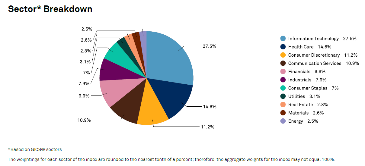
The pie chart above shows the sector breakdown of the S&P as end of July 2020
The S& P500 has 505 constituents with a total market capital of $28.473 trillion with the mean value of its constituents being $56.36 billion as at end of July 2020
9 March 2020: S&P 500 vs S&P Emerging BMI (USD)
In this comparison we take a look at the returns provided by the S&P 500 and compare it to the S&P Emerging BMI (USD) over the last 10 years. But first lets get a little bit more detail regarding the S&P Emerging BMI (USD)
The S&P Emerging BMI captures all companies domiciled in the emerging markets within the S&P Global BMI with a float-adjusted market capitalization of at least USD 100 million meeting 6- and 12-month median value traded requirements. The index is segmented by country/region, size (large, mid and small), style (value and growth), and GICS (sectors/industry groups). The relative weight of some of the biggest EM countries included in this index.
The interactive graphic above shows the performance of the S&P over the last month. Users can select predefined time periods under the zoom category or type in their own (as long as its within the last 10 years). Once the reader selects to compare the S&P 500 to the Nasdaq the graphic calculates the returns provided by the S&P 500 well as the Nasdaq over the time period selected or provided by the user.
The S&P Emerging BMI captures all companies domiciled in the emerging markets within the S&P Global BMI with a float-adjusted market capitalization of at least USD 100 million meeting 6- and 12-month median value traded requirements. The index is segmented by country/region, size (large, mid and small), style (value and growth), and GICS (sectors/industry groups). The relative weight of some of the biggest EM countries included in this index.
- China: 38.5%
- Taiwan, ROC: 13.7%
- India: 11.8%
- Brazil: 7.6%
- South Africa: 4.4%
- Russia: 4.1%
- Saudi Arabia: 2.8%
The interactive graphic above shows the performance of the S&P over the last month. Users can select predefined time periods under the zoom category or type in their own (as long as its within the last 10 years). Once the reader selects to compare the S&P 500 to the Nasdaq the graphic calculates the returns provided by the S&P 500 well as the Nasdaq over the time period selected or provided by the user.
- 1 month:
- S&P 500: -9.13%
- S&P Emerging BMI (USD): -4.72%
- Year to date:
- S&P 500: -6.4%
- S&P Emerging BMI (USD): -7.06%
- 1 year:
- S&P 500: 10.24%
- S&P Emerging BMI (USD): -1.24%
- 3 years:
- S&P 500: 27.99%
- S&P Emerging BMI (USD): 6.05%
- 5 years:
- S&P 500: 46.25
- S&P Emerging BMI (USD): 5.66%
- 10 years (Max):
- S&P 500: 158.58%
- S&P Emerging BMI (USD): 2.16%
The above shows that when looking at the performance of the S&P 500 and comparing it to the S&P Emerging BMI (USD) the S&P 500 by far outperformance the Emerging BMI (measured in Dollar terms). One of the main reasons for this is the fact that the US Dollar as has been very strong in recent years and even if the emerging markets perform well the fact that the US Dollar is very strong is eating into the returns of the Emerging BMI
8 March 2020: S&P 500 vs Nasdaq over the last 10 years
The interactive graphic above shows the performance of the S&P over the last month. Users can select predefined time periods under the zoom category or type in their own (as long as its within the last 10 years). Once the reader selects to compare the S&P 500 to the Nasdaq the graphic calculates the returns provided by the S&P 500 well as the Nasdaq over the time period selected or provided by the user.
The summary below shows the returns of both the S&P 500 and the Nasdaq over various time periods:
From the numbers above one can and rightly so ask the question why one would invest in the S&P 500 instead of just investing in the Nasdaq? When the markets go up the Nasdaq has tended to outperform the S&P 500 and on down turns the Nasdaq declines less than the S&P 500. So why invest in the S&P instead of the Nasdaq? Our believe is that if one is looking to invest in particular indices, its best to have a balanced portfolio with exposure to both these indices, as sector rotation will take and during certain periods the one will outperform the other and during different periods the other is likely to outperform. So best idea is to hedge ones bets by diversifying and ensuring exposure to both.
- 1 month:
- S&P 500: -9.13%
- Nasdaq: -8.21%
- Year to date:
- S&P 500: -6.4%
- Nasdaq: -2.61%
- 1 year:
- S&P 500: 10.24%
- Nasdaq: 15.76%
- 3 years:
- S&P 500: 27.99%
- Nasdaq: 45.06%
- 10 year (Max):
- S&P 500: 158.58%
- Nasdaq: 257.62%
From the numbers above one can and rightly so ask the question why one would invest in the S&P 500 instead of just investing in the Nasdaq? When the markets go up the Nasdaq has tended to outperform the S&P 500 and on down turns the Nasdaq declines less than the S&P 500. So why invest in the S&P instead of the Nasdaq? Our believe is that if one is looking to invest in particular indices, its best to have a balanced portfolio with exposure to both these indices, as sector rotation will take and during certain periods the one will outperform the other and during different periods the other is likely to outperform. So best idea is to hedge ones bets by diversifying and ensuring exposure to both.
6 March 2020: S&P 500 vs Dow Jones Industrial Average over the last 10 years
The interactive graphic above shows the performance of the S&P over the last month. Users can select predefined time periods under the zoom category or type in their own (as long as its within the last 10 years). Once the reader selects to compare the S&P 500 to the Dow Jones Industrial Average the graphic calculates the returns provided by the Dow Jones as well as the S&P 500 over the time period selected or provided by the user.
The image below shows the Dow Jones Industrial Average compared to the S&P 500 over the last 10 years. And the S&P has provided investors with slightly better returns than the Dow Jones has. Over the the last 10 year the Dow Jones Industrial Average increased by 140.6% while the S&P 500 increased by 158.6% over the last 10 years.
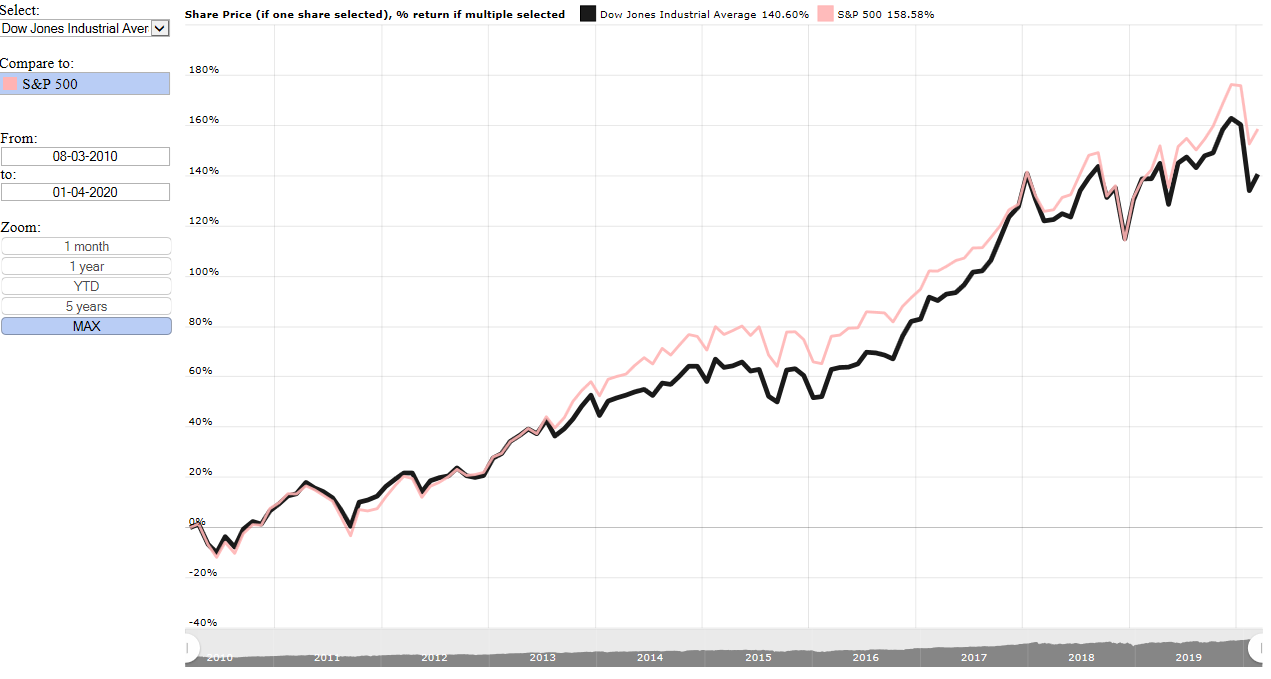
Dow Jones Industrial Average (DJIA) vs S&P 500 over the last 10 years
So how has the S&P 500 performed during various recessions in the USA? In the graphic below, obtained from Macrotrends.net we highlight a few of the United States's longest recessions, which took place in 1929, 1973 and 2007. With the longest recession taking place during 1929 with the recession lasting a total of 43 months. or almost 3 and a half years.
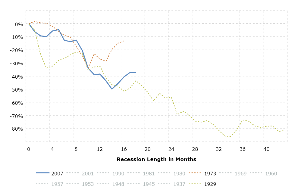
S&P 500 performance during various recessionary periods
The summary below shows the Dow Jones Industrial Average (DJIA) performance for the recessions in the graphic below for a 16 month period. A time period all recessions in the graphic above at least lasted for.
The above shows that the S&P 500 was hardest hit by the 1929 and 2007 recessions.
- 1973 recession: -13.1%
- 2007 recession: -40.6%
- 1929 recession: -51.6%
The above shows that the S&P 500 was hardest hit by the 1929 and 2007 recessions.