
Dow Jones Industrial Average (DJIA) studied in more detail page
|
Category: Stock Market and Dow Jones Industrial Average (DJIA)
Last Updated: 7 January 2021 The main aim of this page is to look at the Dow Jones Industrial Average in more detail and from various perspectives from comparing the Dow Jones Industrial Average Index (DJIA) against other major indices such as the Nasdaq and the S&P 500 to looking at the performance of the Dow Jones Industrial Average (DJIA) under various FED chairs.
|

|
We look to provide online news and updates of the Dow Jones and the Dow Jones Industrial Average Stocks"
About the Dow Jones Industrial Average Index |
Sector breakdown of DJIA for December 2020 |
|
The Dow Jones Industrial Average® (The Dow®), is a price-weighted measure of 30 U.S. blue-chip companies. The DJIA covers all industries except transportation and utilities. The market cap of the Dow Jones firms amounts to $9.607 trillion as at end of December 2020. The Dow Jones Industrial Average has a trailing PE ratio of 29.39 and the PE is projected (forward PE) is at 24.99 with a indicated dividend yield of 1.96% and a price to book value of 4.92
|
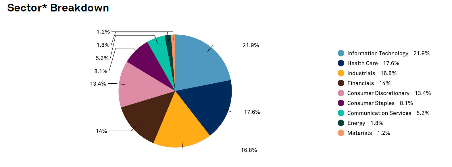
The pie chart above shows the sector breakdown of the Dow Jones Industrial Average as end of December 2020
|
7 January 2021: Performance of the Dow Jones, Nasdaq and S&P over various time periods
This section will take a look at the performance of the NASDAQ, Dow Jones Industrial Average Index and the S&P 500 over various time periods including the last week, month, year and over the last 10 years. Based on closing values as at 4 January 2021
1 week:
1 month:
1 year:
5 years:
10 years:
1 week:
- S&P500: 1.43%
- Dow Jones Industrial Average (DJIA): 1.35%
- NASDAQ: 0.65%
1 month:
- NASDAQ: 4.36%
- Dow Jones Industrial Average (DJIA): 2.42%
- S&P500: 2.37%
1 year:
- NASDAQ: 42.87%
- S&P500: 16.11%
- Dow Jones Industrial Average (DJIA): 6.89%
5 years:
- NASDAQ: 179.3%
- S&P500: 93.6%
- Dow Jones Industrial Average (DJIA): 85.9%
10 years:
- NASDAQ: 377.3%
- S&P500: 192%
- Dow Jones Industrial Average (DJIA): 157.4%
3 September 2020: Latest Dow Jones Industrial Average constituents
The list below (sorted alphabetically) shows the newest list of Dow Jones Industrial Average constituents effective from the end of August 2020: The new additions highlighted in green:
The three constituents that were dropped:
- 3M Co.
- American Express Co.
- Amgen
- Apple Inc
- Boeing Co.
- Caterpillar Inc.
- Chevron Corp.
- Cisco Systems, Inc.
- Coca-Cola Co
- Dow Inc
- Goldman Sachs Group, Inc.
- Home Depot, Inc.
- Honeywell
- IBM
- Intel Corp.
- Johnson & Johnson
- JPMorgan Chase & Co.
- McDonald's Corp
- Merck & Co Inc
- Microsoft Corporation
- Nike, Inc. - Class B Shares
- Procter & Gamble Co.
- Salesforce
- Travelers Companies Inc.
- Unitedhealth Group Inc
- Verizon Communications Inc
- Visa Inc - Class A Shares
- Walgreens Boots Alliance Inc
- Walmart Inc
The three constituents that were dropped:
- Exxon
- Pfizer
- Raytheon
Dow Jones vs S&P 500 vs Nasdaq chart (up to 31 Aug 2020)
The graphic below shows the index performance of the Dow Jones Industrial Average (DJIA) over the last month. As soon as a reader selects the S&P 500 or Nasdaq in the box to the top left the graphic adds these indices and then shows the return provided by each of the selected indices for the time period selected. Readers can select their own dates within the last 10 years or use any of our predefined dates in the zoom box
Google Search Trends for Dow Jones Industrial Average (DJIA), Nasdaq and S&P500
11 June 2020: Dow Jones Industrial Average (DJIA) declining sharply. We warned about this
11 June 2020: On the 28th of May 2020 we said that something about the Dow Jones Industrial Average (DJIA) performance doesn't add up. And it looks like the market is finally waking up to this, as the Dow saw two days of relatively small declines (just over -1%) yesterday and the day before, but on 11 June 2020 the Dow took a very serious knock with it being down -6.9% for the day so far. Read our warning 28 May 2020 here
We dont believe the sell off is done just yet. We expect the Dow Jones, the Nasdaq and the S&P500 to pull back a lot more, as the full impact of the Covid-19 pandemic has not filtered through all world economies and companies yet.
The Dow Jones (DJIA) declined by a massive -6.9% on 11 June 2020 . See more about the daily Dow Jones Industrial performance here
28 May 2020: Is the Dow Jones and the rest of the market ignoring the impact of Covid-19?
We are worried about the strength of the markets considering the significant impact the Covid-19 pandemic has had on global economic growth and employment across the world. In the United States alone millions have lost their jobs in the last 2 months. Thousands upon thousands of companies have closed their doors permanently, yet the markets has largely ignored these issues, bar the short sharp sell off in March 2020. But since then the markets has recovered sharply. Is it a case of the bulls expecting a V-shaped economic recovery, or is all the money being pumped into the financial system by central banks across the world flooding into financial markets and this is falsely propping up the markets? Over the last 12 months the DJIA has moved from 25347.77 as at 28 May 2019 to 25548.27 as at end 27 May 2020. So the DJIA increased by 0.79% over the last 12 months, This will around 30 million people in the US lost their jobs? Something doesn't add up. The image below obtained from MacroTrends.net shows the movement of the Dow Jones over the last 12 months
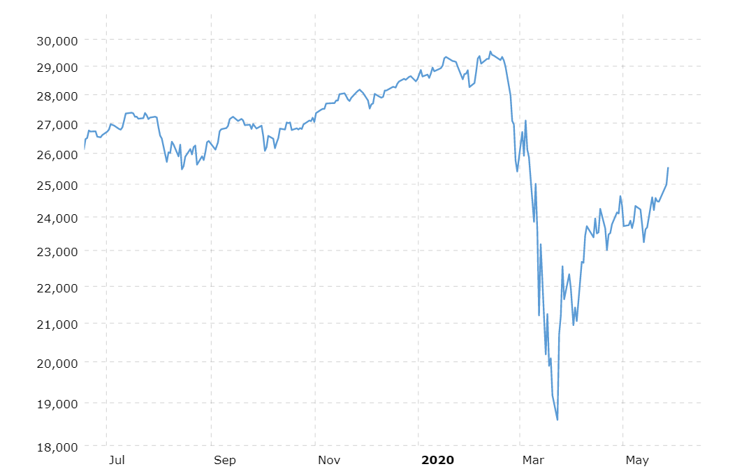
The Dow Jones Industrial Average (DJIA) performance over the last 12 months
We are usually very bullish but the numbers aren't adding up. The stock markets and the stock prices of firms listed on it cannot ignore and not reflect the economic realities currently facing economies, companies and people across the world. So a word of caution from us. Be very careful when investing in the markets right now as we believe the markets are being propped up right now.
25 May 2020: Dow Jones Industrial Average (DJIA) performance for May 2020
The graphic below shows the performance of the Dow Jones Industrial Average (DJIA) on a calendar for every trading day of May 2020. So far the month of May has been a fairly volatile one with some very strong days and some very negative trading days. Overall as at 25 May 2020 the Dow Jones Industrial Average is up by 0.7% for the months of May 2020
19 May 2020: Performance of the Dow. Trump vs Obama
Our friends at Mactotrends.net was kind enough to supply the graphic below. It shows the stock market performance under former President Barack Obama and compares it to that of current President, Donald Trump. Since Donald Trump is 42 months into his term we will compare the returns of the DJIA under both presidents at 42 months into their respective terms
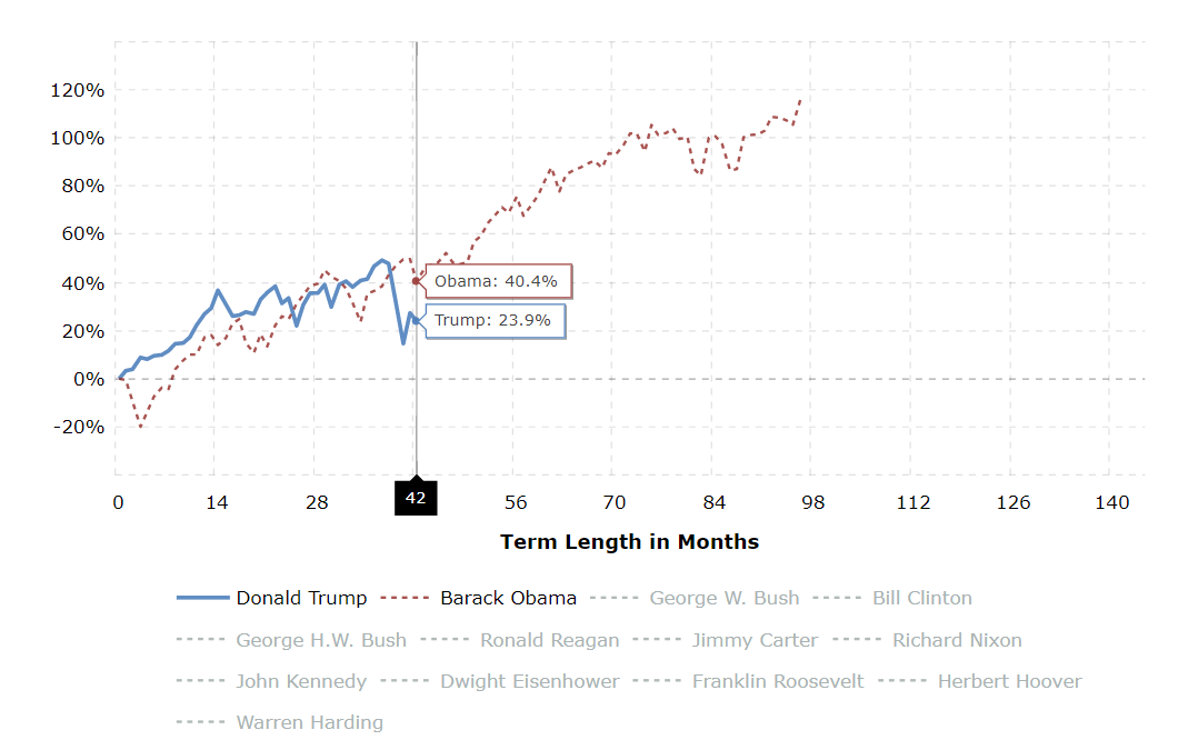
Dow Jones Industrial Average under President Trump and President Obama
So 42 months into President Barack Obama's presidency the Dow Jones gained 40.4%, while 42 months into Donald Trump's presidency the Dow Jones has gained 23.9%. So the returns of the Dow 42 months into Donald Trump's presidency is far lower than that of the returns provided by the Dow Jones for the same time period under Barack Obama.
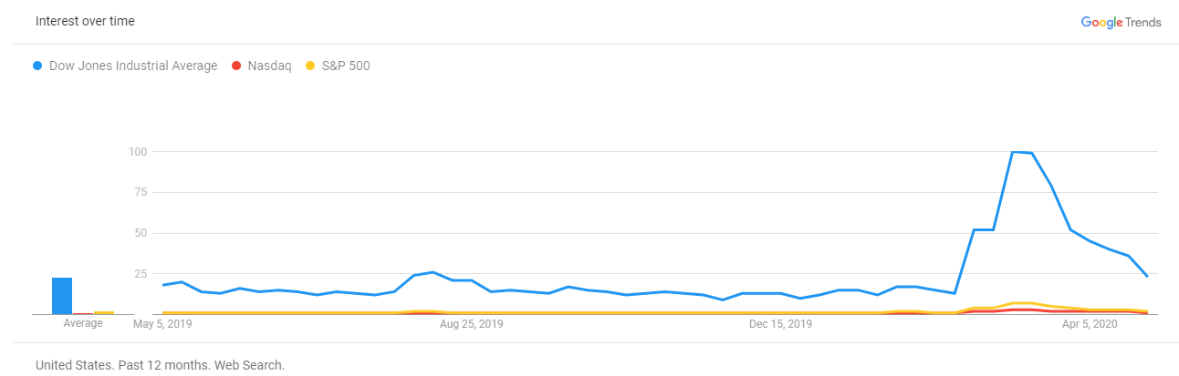
23 April 2020: Dow Jones vs S&P500 vs Nasdaq in Google Search Results in the USA
So when in doubt Americans google Dow Jones Industrial Average way more than Nasdaq or S&P500 when it comes to financial market indices, as this graphic from Google Trends reveal. Over the last 5 years the number of queries for Dow Jones Industrial Average via Google is far greater than that of Nasdaq or S&P500. So the Dow Jones (DJIA) remains the mac daddy of financial market indices that people want to know about. And there are significant peaks in the search numbers for Dow Jones Industrial Average (and to a lesser extent the Nasdaq and S&P500).
Dow Jones vs S&P 500 vs Nasdaq (last updated 2 May 2020)
The interactive graphic above shows the performance of the Dow Jones Industrial Average over the last month. Users can select predefined time periods under the zoom category or type in their own (as long as its within the last 10 years). Once the reader selects to compare the Dow Jones Industrial average to the Nasdaq the graphic calculates the returns provided by the Dow Jones as well as the Nasdaq over the time period selected or provided by the use
For more detailed information and comparisons of the Dow Jones Industrial Average (DJIA) read on below.
14 March 2020: Dow Jones, S&P and Nasdaq spikes and erases significant losses of day before
The losses of the day before (12 March 2020) were basically erased as markets spiked up significantly on Friday 13 March 2020. The interactive graphic above shows the performance of the Dow Jones Industrial Average over the last month. Users can select predefined time periods under the zoom category or type in their own (as long as its within the last 10 years). Once the reader selects to compare the Dow Jones Industrial average to the Nasdaq the graphic calculates the returns provided by the Dow Jones as well as the Nasdaq over the time period selected or provided by the user.
As the graphic above shows it's been a very volatile but still significantly declining market in recent times. The image below shows the performance of the Dow Jones Industrial Average, S&P 500 and the Nasdaq over the last trading week (9 March 2020 to 13 March 2020), in a trading week that will probably go down as one of the most brutal and volatile trading weeks in history.
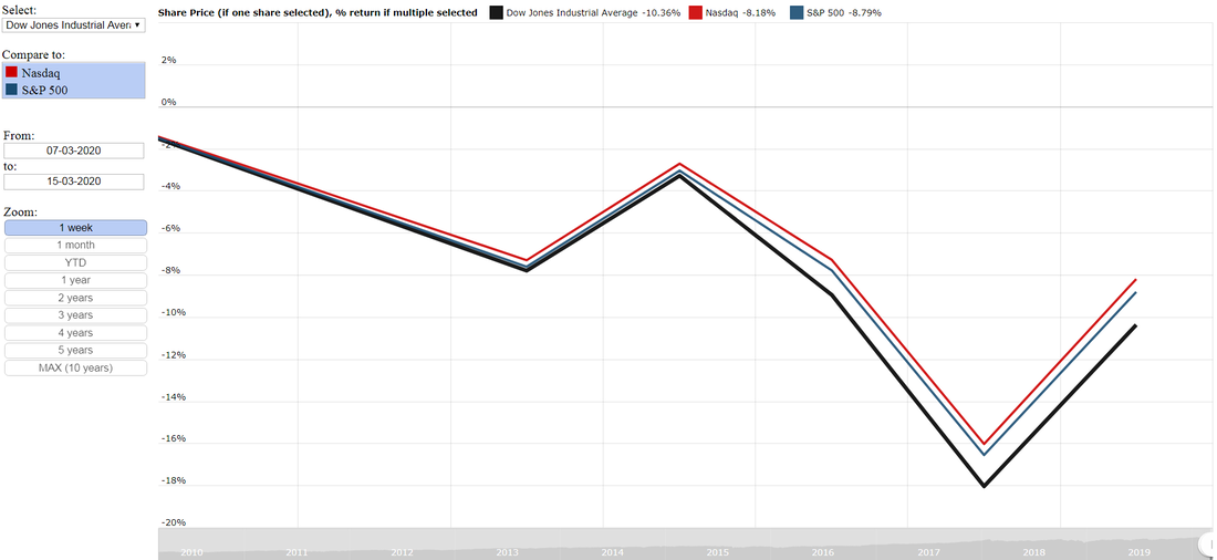
Dow Jones, S&P 500 and Nasdaq returns for the trading week 9 March 2020 to 13 March 2020. One of the most volatile trading weeks ever. Is the latest spike in markets a dead cat bounce?
The summary below shows the performance of the Dow Jones, S&P and Nasdaq for Friday, 13 March 2020:
The question on everyone's lips is whether this is just a dead cat bounce and will there be continued downside to ever lower lows in coming weeks. And our prediction is that there will another phase in which the markets sells off before things starts stabilising and normalising. Our advice would be to sit on the sidelines and observe trading moves over the short term, instead of piling into the market now only to find that there is even lower lows to be made.
- Dow Jones: 9.36%
- Nasdaq: 9.34%
- S&P 500: 9.29%
The question on everyone's lips is whether this is just a dead cat bounce and will there be continued downside to ever lower lows in coming weeks. And our prediction is that there will another phase in which the markets sells off before things starts stabilising and normalising. Our advice would be to sit on the sidelines and observe trading moves over the short term, instead of piling into the market now only to find that there is even lower lows to be made.
13 March 2020: Dow Jones, S&P and Nasdaq has worst trading day since 1987
Yesterday (12 March 2020) the US markets had its worst trading day since Black Monday in 1987. With all the major quoted indices declining almost 10% for the day. The summary below shows the performance of the major indices for 12 March 2020:
This latest stock market route has written off trillions of US dollars of market capital across the globe with little to no end in sight as the Indian Stock Exchange and the most quoted index the Nifty 50 plunged more than 10% in today's (13 March 2020) trade and triggered a circuit breaker which halted trade temporarily.
As the saying goes, things will get worse before they get better. And it seems the same applies to global stock markets. Remember its not the end of the world. Markets will go back up again. If you invested for the long term, look to add quality stocks paying good dividends at depressed prices as sell off's such as these do provide excellent buying opportunities to those willing to take the chance by adding or buying when markets are in free fall as it currently is,
- Nasdaq: -9.43%
- Dow Jones: -9.99%
- S&P 500: -9.51%
This latest stock market route has written off trillions of US dollars of market capital across the globe with little to no end in sight as the Indian Stock Exchange and the most quoted index the Nifty 50 plunged more than 10% in today's (13 March 2020) trade and triggered a circuit breaker which halted trade temporarily.
As the saying goes, things will get worse before they get better. And it seems the same applies to global stock markets. Remember its not the end of the world. Markets will go back up again. If you invested for the long term, look to add quality stocks paying good dividends at depressed prices as sell off's such as these do provide excellent buying opportunities to those willing to take the chance by adding or buying when markets are in free fall as it currently is,
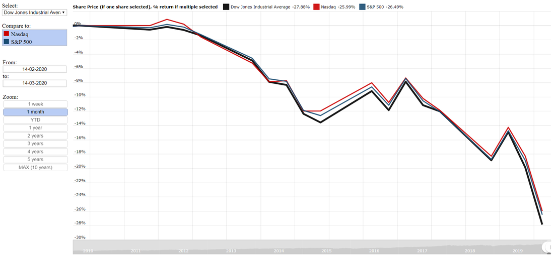
The single worst trading day on US markets since Black Monday in 1987. We call it Terrified Thursday
So as the image above shows its been absolute carnage on the markets in recent weeks. The summary below shows the decline in the Dow Jones Industrial Average, S&P 500 and the Nasdaq over the last month:
- Dow Jones Industrial Average: -27.88%
- Nasdaq: -25.99%
- S&P 500: -26.49%
11 March 2020: Constituents of the Dow Jones Industrial Average
So ever wanted to know who the 30 companies within the Dow Jones Industrial Average are? Below the list of 30 companies contained in the Dow Jones Industrial Average. It shows the stock code first and then the company name.
- MMM -3M
- AXP- American Express
- AAPL- Apple
- BA -Boeing
- CAT- Caterpillar
- CVX -Chevron
- CSCO- Cisco
- KO -Coca-Cola
- DIS -Disney
- DOW -Dow Chemical
- XOM -Exxon Mobil
- GS -Goldman Sachs
- HD- Home Depot
- IBM- IBM
- INTC- Intel
- JNJ -Johnson & Johnson
- JPM -JPMorgan
- MCD -McDonald's
- MRK -Merck
- MSFT -Microsoft
- NKE -Nike
- PFE -Pfizer
- PG -Procter & Gamble
- TRV- Travelers Companies Inc
- UTX -United Technologies
- UNH -UnitedHealth
- VZ -Verizon
- V- Visa
- WMT -Wal-Mart
- WBA- Walgreen
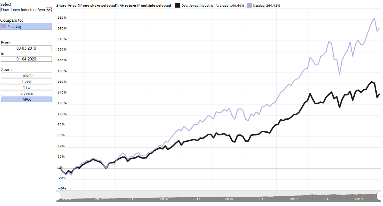
6 March 2020: Dow Jones Industrial Average vs Nasdaq over the last 10 years
The interactive graphic above shows the performance of the Dow Jones Industrial Average over the last month. Users can select predefined time periods under the zoom category or type in their own (as long as its within the last 10 years). Once the reader selects to compare the Dow Jones Industrial average to the Nasdaq the graphic calculates the returns provided by the Dow Jones as well as the Nasdaq over the time period selected or provided by the user.
The image below shows the Dow Jones Industrial Average compared to the Nasdaq over the last 10 years. And the Nasdaq has provided investors with far better returns than the Dow Jones has. Over the the last 10 year the Dow Jones Industrial Average increased by 140.6% while the Nasdaq increased by a whopping 264.4% over the last 10 years. With FAANG stocks such as Netflix, Amazon, Alphabet (read Google) helping to propel the Nasdaq to far greater heights than the Dow Jones.
6 March 2020: Dow Jones Industrial Average vs S&P 500 over the last 10 years
The interactive graphic above shows the performance of the Dow Jones Industrial Average over the last month. Users can select predefined time periods under the zoom category or type in their own (as long as its within the last 10 years). Once the reader selects to compare the Dow Jones Industrial Average to the S&P 500 the graphic calculates the returns provided by the Dow Jones as well as the S&P 500 over the time period selected or provided by the user.
The image below shows the Dow Jones Industrial Average compared to the S&P 500 over the last 10 years. And the S&P has provided investors with slightly better returns than the Dow Jones has. Over the the last 10 year the Dow Jones Industrial Average increased by 140.6% while the S&P 500 increased by 158.6% over the last 10 years.

Dow Jones Industrial Average (DJIA) vs S&P 500 over the last 10 years
5 March 2020: Dow Jones Industrial Average performance during recessions
So how has the Dow Jones Industrial Average (DJIA) performed during various recessions in the USA? In the graphic below, obtained from Macrotrends.net we highlight a few of the United States's longest recessions, which took place in 1920, 1929, 1973 and 2007. With the longest recession taking place during 1929 with the recession lasting a total of 43 months. or almost 3 and a half years.
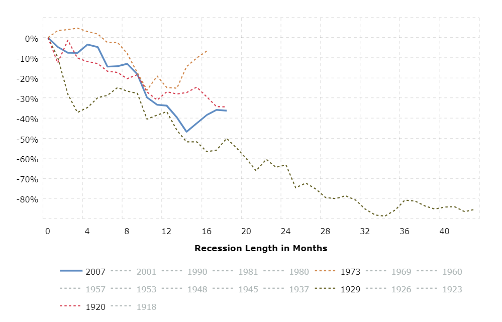
The summary below shows the Dow Jones Industrial Average (DJIA) performance for the recessions in the graphic below for a 16 month period. A time period all recessions in the graphic above at least lasted for.
The above shows that the Dow Jones Industrial Average was hardest hit by the 1929 and 2007 recessions.
- 1973 recession: -6.6%
- 1920 recession: -29.5%
- 2007 recession: -38.4%
- 1929 recession: -56.7%
The above shows that the Dow Jones Industrial Average was hardest hit by the 1929 and 2007 recessions.
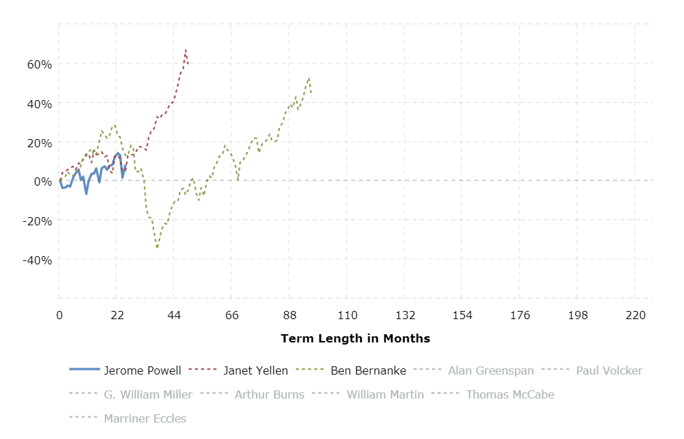
5 March 2020: Dow Jones Industrial Average under Bernanke, Yellen and Powell
So 25 months into Jerome Powell's tenure as the head of the Federal Reserve, how has the markets performed over this 25 month period compared to the first 25 months of Ben Bernanke and Janet Yellen's reign? The summary below provides the return of the three Fed Chairs over the first 25 months of each of their tenures.
- Ben Bernanke: 12.9%
- Jerome Powell: 8.2%
- Janet Yellen: 5.2%
3 March 2020: President Trump vs President Barack Obama. Under who did the Dow perform better?
In recent months (before the arrival of the Coronavirus which sent markets crashing), President Trump kept boasting about how well the stock market has performed under his reign as US President. While the market has performed extremely well under him, the question is how has it been doing when its compared to the returns the Dow Jones made under President Barack Obama? We went looking for answers and our friends at Macrotrends.net provided it.
The summary of the graphic below is provided by Macrotrends and states the following:
Historical data is inflation-adjusted using the headline CPI and each data point represents the month-end closing value. The current month is updated on an hourly basis with today's latest value. The current price of the Dow Jones Industrial Average as of March 02, 2020 is 26,703.32.
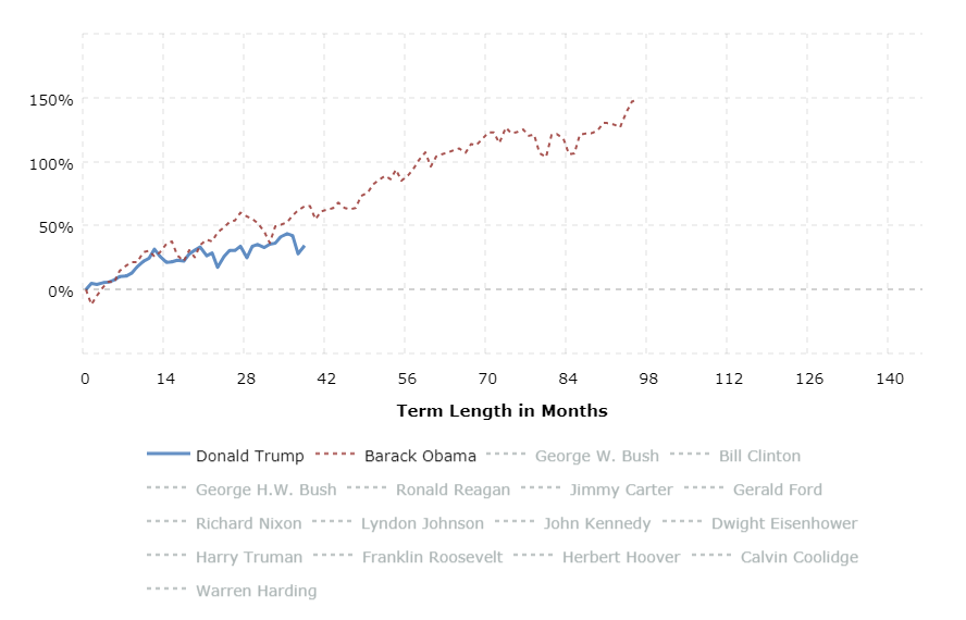
Dow Jones industrial average return provided for President Trump and former President Barack Obama
So while the returns of the Dow Jones Industrial average has mostly been positive for both President Trump and former President Barack Obama it is former President Obama that has the upper hand. After a year into their respective presidencies the Dow recorded growth of 31.6% under Trump and 25.8% under Obama. Two years into their respective presidencies the Dow recorded 48.6% under Obama and 25.9% under Trump.
And based on the latest numbers 38 months into their respective presidencies the Dow recorded gains of 65.1% under Obama and 34.4% under President Trump. Based on these numbers one wonders if President Trump should really brag about the performance of the stock market when the returns provided by the Dow under his presidency is currently far lower than it was over the same time period of President Barack Obama?
So how does Obama's returns compare against his predecessor former President George W Bush? We take a look below
President Barack Obama vs President George W Bush. Under who did the Dow perform better?
The image below shows the performance of the Dow Jones Industrial Average under former Presidents Barack Obama and President George W Bush. And from the image it is clear that over the term of their respective presidencies the Dow Jones had a much better time under former President Barack Obama than it did under former President George W Bush. And both of these presidents had crises' to deal with. President Bush had the 9-11 terror attacks and the resulting conflicts and wars emanating from this while Obama had the sub-prime lending crises and the great recession to deal with.
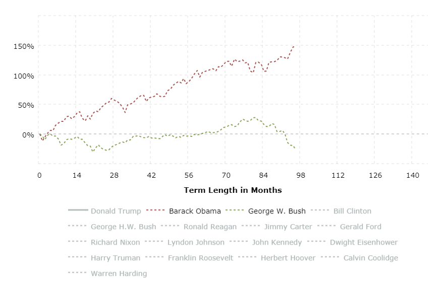
Down Jones Industrial average returns under former Presidents Barack Obama and George W. Bush.
Looking at the performance of the Dow Jones under former presidents Barack Obama and George W Bush there is only one winner here. And that is Barack Obama. By the time former President George Bush left the oval office the Dow Jones actually declined in real terms. The Dow Jones real returns provided over the course of the presidential terms saw the following. Under President Barack Obama: 147% and under President George W Bush -26.5%. So absolutely nothing to write home about for former President George W Bush.